Timbre Winery
Developing a guide for future designers + use
Branding | Internship | 2020
Project Goals
How can we create guidelines for the existing brand and develop clear rules for future applications and additions as Timbre develops and changes?
Project Outcomes
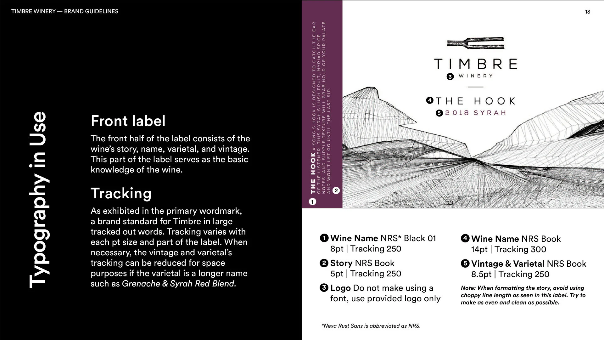
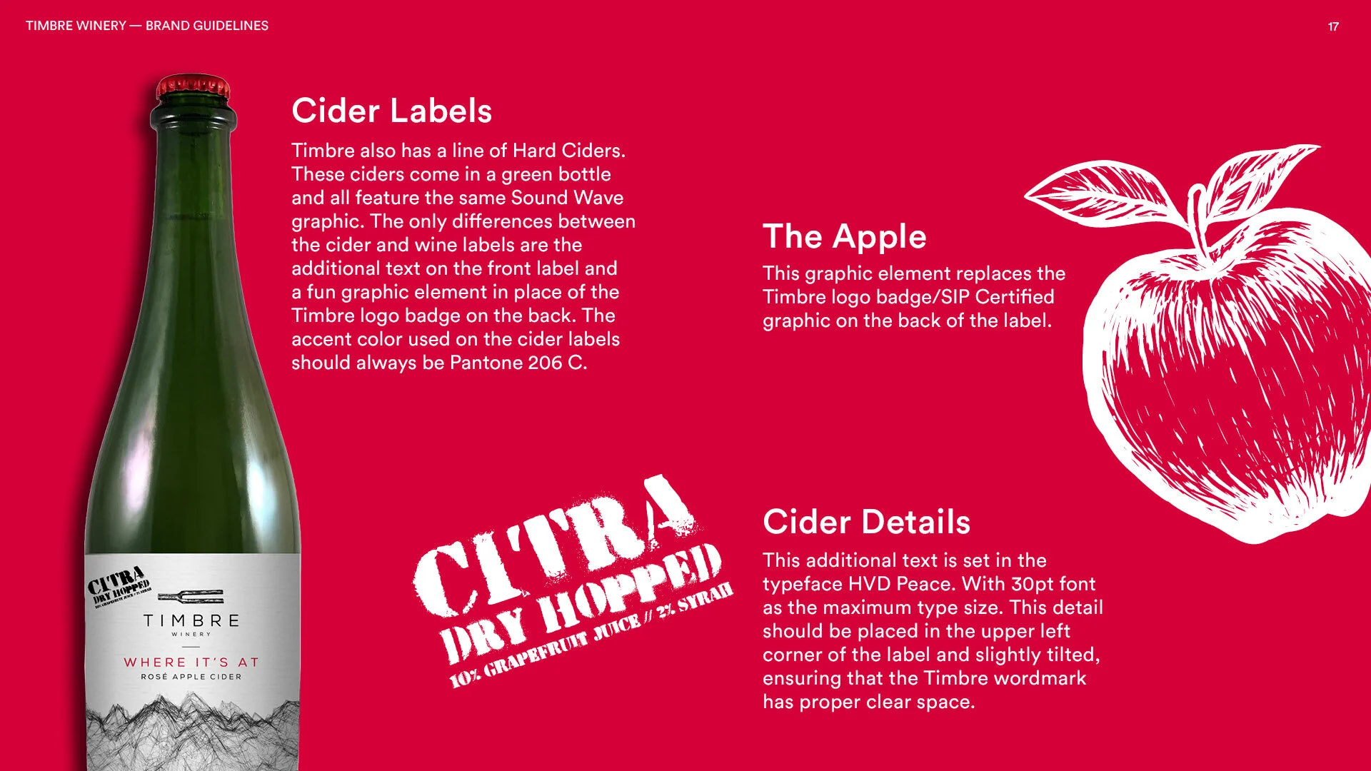
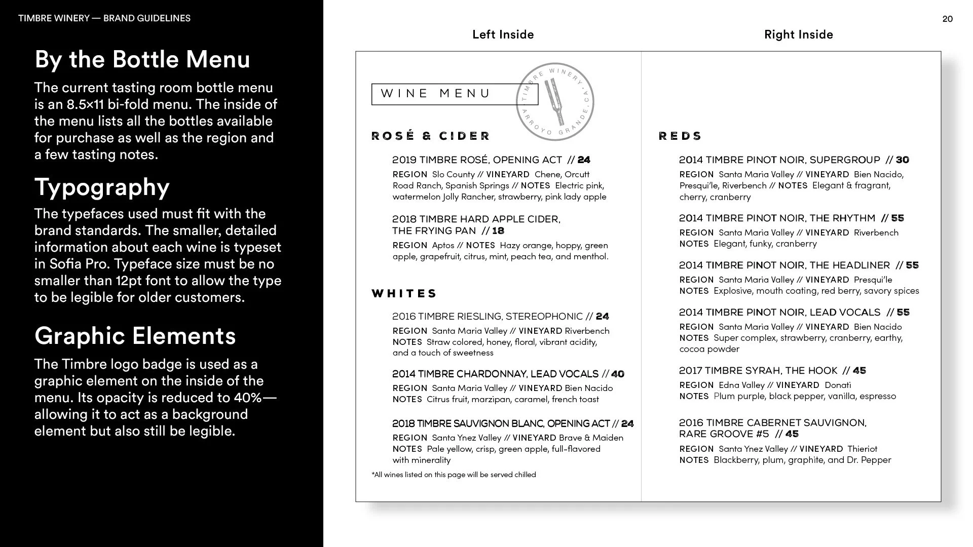
A comprehensive guide to wine label formatting, how to use the logo, print collateral and how to design new labels that fit the brand standards and values.
Defining Timbre’s Brand
As the only designer for Timbre, I had to find ways to re-create labels from previous files that had no consistency.
Defining the brand was easy since Timbre already had a vision for their look and values set in stone.
Design Guide
Easy to follow, but also engaging.
Simple, bold, and universal
When designing the brand guideline, I kept the brand in mind. However, I needed to use a different typeface that was more legible and universal but fit the feel of the brand.
Monochrome with a pop
Timbre’s color system mainly consists of black and white, but each varietal has its own unique pop of color. Implementing these warm tones makes the guideline more engaging.


