


Austin Construction Resources & Experts
Full service construction & integrity management provider serving the oil and gas industry.
Branding, Logo design | Freelance | 2020
Project Goals
How can I design a construction brand that stands out and focuses on its unique values and services?
Project Outcomes
A bold, well-defined brand identity system that can be applied across multiple platforms in the future.
Project Values
Innovation, inclusivity, efficiency, integrity, and of course–meeting the highest standards possible.
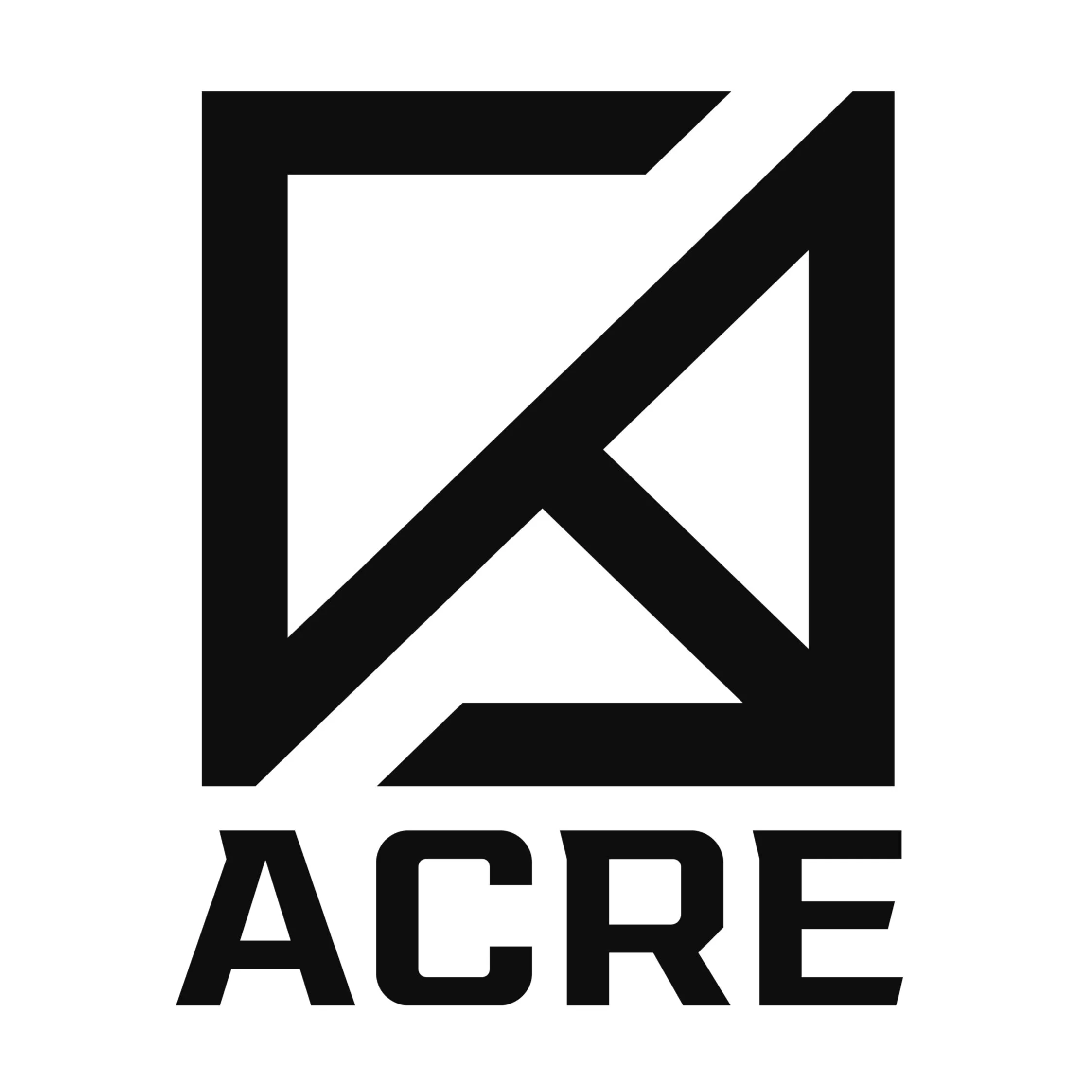
Branding ACRE
Creating a bold, geometric wordmark was essential to the identity of the brand.
The graphic logo mark is a key way to identify ACRE even without the name. The sharp angles in the sans serif typeface echo the form of the “geo A” to create a balanced, sharp, design.
Process
Typeface Family
The first goal in branding ACRE was defining a visual identity for the wordmark. I provided the client with multiple variations for typeface options—many were too chunky or resembled the look of a tech or digital firm.
Color System
Most construction brands have a warmer color palette. Burnt reds, oranges or darker yellows help ACRE’s brand feel more sophisticated by avoiding the bright obnoxious construction-cone orange.


Final Experience
Blocky, Bold, and Burly.
The graphic logo mark incorporates much more than an abstract A—it allows the viewer to construct their own idea about what the shape truly is. The logo mark incorporates the forms of the letters A, C, R, (and kinda E), but its angular shapes that form arrows also represent ACRE’s values that move construction management forward.
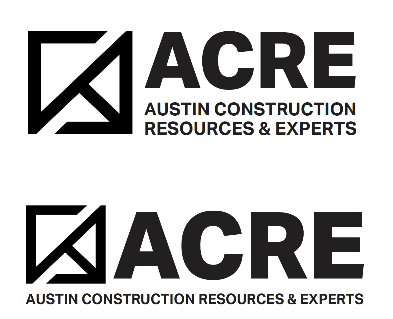
In its entirety, the new brand spanned logos, a new website (designed by owner), and business cards.


